
Section 2: Document Markup
Chapter 22: Responsive Styling
Our last rule concept of “When” can be applied to responsive design. It applies to rule conditions being, such as a user has a device with a mobile screen, or is trying to print our page. Since these are not within our default display, we may wish to remove elements or modify our layout to support a small screen, or remove background images and colors to make printed versions easier to read and less taxing on ink supplies.
To do this from within our style sheet, we need to specify the differences between our selectors that apply to these use cases. When we want to make style changes based on the user’s device, it is best to test for the existence of the feature in the browser, or for a specific feature or setting of a device, instead of the name and version that it identifies itself as. For example, if we consider the browser’s current width, it does not matter what the device is. A user could be on a desktop but have the browser much smaller than full screen. We also do not want to maintain a list in our code of every mobile phone size, especially when most of them fall within a limited range. By just checking the size, we can categorize the device and give it a best-guess-fit appearance.
Another argument for this approach is how the level of support for features changes both as standards change and as browsers are updated. If we only check the browser name, and a newer release than we were aware of supports the feature we want, we would lose out on the feature we want to implement. Instead, we can try and “test load” some of the features we want, or include fall back rules (like we did in our gradient example) to give ourselves the widest amount of support we can.
To test by feature or capability, we use the media queries feature of CSS. We will use screen size as an example. While not a perfect science, there are roughly 4 basic screens to consider, along with their average sizes:
- Smart phones (portrait)—320 pixels
- Tablets (portrait)—768 pixels
- Tablets (landscape), netbooks—1024 pixels
- Laptops, desktops—1024 or higher
This by no means captures every device or possible resolution. For example mini-tablets (or the trend of phablets/oversized cell phones) can fall around the 480 pixel range. Whether you want to support different layouts for these devices will determine if you need to consider more variety than the list above, but once we implement more responsive features you will see how these devices will usually receive an acceptable viewing experience. Next we will create new sections in our CSS that define what changes are necessary for those sizes. Some browsers and devices, like Apple’s Safari browser, will attempt to fit the entire page into their device screen by reporting to be a full size device. To prevent this, we can add the following meta tag to our HTML:
- <meta name=”viewport” content=”width=device-width; initial-scale=1.0″>
This line tells the browser to report its actual device width so we can provide the proper view.
Next, we need to create a series of selectors that will test for our different scenarios. Using media queries to guide our decision:
- @media only screen and (max-width: 959px) {}
- // Smaller than desktop/laptop (tablets, netbooks)
- @media only screen and (min-width: 768px) and (max-width: 959px) {} //Portrait or landscape tablets, netbooks
- @media only screen and (max-width: 767px) {}
- // devices smaller than portrait tablets (mobile)
- @media only screen and (min-width: 480px) and (max-width: 767px) {} // mobile landscape to tablet portrait
- @media only screen and (max-width: 479px) {}
- // mobile up to landscape mode
If you already have some CSS written, you can add these selectors below your existing code. Any rules in your existing code that are not overwritten by one of these selectors will remain in use, and become your “fall back” rules. This is why we did not include a media query for full size devices (although you could, if you wanted a different set of rules to be your fall back, say to assume a smaller device instead of a full size device as your default style).
Within each of these new selectors is where we would override our “normal” style to adjust our user experience. Anywhere we used floating divs will automatically adjust (within their parent container) as the window size changes. With these selectors, we can move other pieces of content around or even turn off some items that are unwieldy on smaller devices. Larger ads may be too large in screen size and file size for easy consumption on a mobile device. To disable it, we add a rule to the media section for smaller devices that hides that content. Imagine we have the following layout:
|
Logo |
||
|
Link 1 Link 2 Link 3 |
Flash ad Content |
An ad Another ad |
|
Contact information |
||
This layout could be represented by the following HTML and CSS:
- <header><img src=”ourlogo.png”></header>
- <div id=”container”>
- <div id=”left”>
- <ul>
- <li><a href=””>Link 1</a></li>
- <li><a href=””>Link 2</a></li>
- <li><a href=””>Link 3</a></li>
- </ul>
- </div>
- <div id=”main”>
- <div id=”splash”>[flash with id “video”]</div>
- <div id=”content”>Our text content here</div>
- </div>
- <div id=”right”>
- <div class=”ad”>an ad here</div>
- <div class=”ad”>another ad </div>
- </div>
- <br style=”clear: left;” />
- </div>
- <footer>Contact Information</footer>
- <style>
- div{
- border-style:dashed;
- border-width:1px;
- }
- header{
- background:url(ourlogo.png) no-repeat;
- background-size:200px 100px;
- background-position:center;
- height:100px;
- }
- #left{
- min-width:100px;
- max-width:150px;
- float:left;
- }
- #main{
- float:left;
- }
- #right{
- min-width:100px;
- max-width:150px;
- float:left;
- }
- </style>
Which, in turn, could generate something like this once we add actual content:
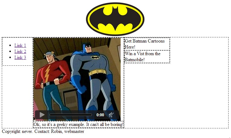 Since we are using floated divs, the site will (eventually) conform to a top to bottom format that retains all content when it cannot fit across the display it is on. This is because float will place the elements in a line when the container is wide enough to hold them. When content is wider than the row, it is wrapped down to a new line. The max and min widths will help to ensure that content is not clipped, but while this helps us in some cases, the bulky flash video and large logo reduce the user’s ability to browse from a mobile device. To adapt this example for users on smaller screens, we want to preserve all of the pertinent content while also preserving a good user experience. To do this, we will hide the video, put our links at the top, and move our ads to the bottom, all by adding media queries to our CSS. We will also opt for a smaller version of our logo. Since our current design was deemed flexible enough for other devices, we will just add the CSS selector for small screens:
- <header><img src=”ourlogo.png”></header>
- <div id=”container”>
- <div id=”left”>
- <ul>
- <li><a href=””>Link 1</a></li>
- <li><a href=””>Link 2</a></li>
- <li><a href=””>Link 3</a></li>
- </ul>
- </div>
- <div id=”main”>
- <div id=”splash”>[flash width id “video”]</div>
- <div id=”content”>Our text content here</div>
- </div>
- <div id=”right”>
- <div class=”ad”>an ad here</div>
- <div class=”ad”>another ad </div>
- </div>
- <br style=”clear: left;” />
- </div>
- <footer>Contact Information</footer>
- <style>
- div{
- border-style:dashed;
- border-width:1px;
- }
- header{
- background:url(ourlogo.png) no-repeat;
- background-size:200px 100px;
- background-position:center;
- height:100px;
- }
- #left{
- min-width:100px;
- max-width:150px;
- float: left;
- }
- #main{
- float:left;
- }
- #right{
- min-width:100px;
- max-width:150px;
- float:left;
- }
- @media only screen and (max-width: 479px){
- video{ display:none; }
- #left{
- width:100%;
- float:none;
- }
- #main{
- width:100%;
- float:none;
- }
- #right{
- width:100%;
- float:none;
- }
- #header{
- background:url(http://www.vectortemplates.com/raster/batman-logo-big.gif) no-repeat;
- background-size:100px 60px;
- background-position:center;
- height:100px;
- }
- }
- </style>
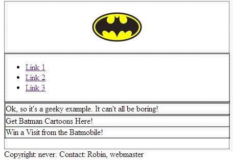
Now, our floats and min/max rules will do the best they can until the device screen is less than 480 pixels. At that point our special style will kick in for mobile devices, putting our divs in a vertical row, hiding and resizing content, and making the divs as wide as the screen. Our site, without changing any HTML, will now look like the following:
 We can also use media queries to set styling for when a user prints our page, without requiring them to click a link to a special version (selecting print from a browser menu would trigger this style) by using @media print{}.
The full list of options for @media are as follows:
|
Name |
Description |
|
all |
All devices. |
|
aural |
Text-to-speech readers. |
|
braille |
Tactile responsive devices. |
|
embossed |
Printing to braille printers. |
|
handheld |
Small portable devices. |
|
|
Print view. |
|
projection |
Slides and presentations. |
|
screen |
Computer screens (regular size and up). |
|
tty |
Teletype terminals. |
|
tv |
TV displays. |
