Section 2: Document Markup
Chapter 20: Layout Formatting
Box Model
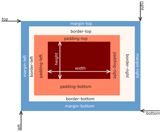 By Matthias Apsel [CC0], via Wikimedia Commons
Borders
To better identify where our content falls on a page, and to signify that it is different from the material around it, we can adjust the borders on our elements. Borders can be enabled or disabled by the top, bottom, left and right of the element and can also have different styles like solid, double, grooved, dotted and dashed lines, among others.
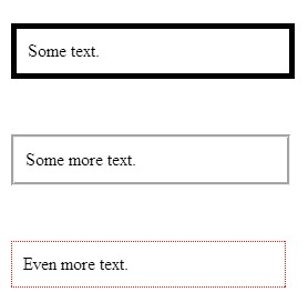
To specify a full border, we simply use border, and can apply color, width, and style:
|
 |
The full list of possible border styles is as follows:
|
Value |
Description |
|
none |
No border. |
|
dotted |
Dotted border. |
|
dashed |
Dashed border. |
|
solid |
Solid border. |
|
double |
Double (two lines) border. |
|
groove |
Grooved, 3d border. |
|
ridge |
Ridged, 3d border. |
|
inset |
Lowered (sunken) 3d border. |
|
outset |
Raised 3d border. |
|
inherit |
Inherits the same style as the parent element. |
Margin and Padding
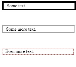
These related concepts allow you to control the amount of space between your content and its container, and between the container and objects around it. Padding controls the amount of space inside your container, for instance between text and a set of paragraph tags. You can remember padding as the inside by thinking about a padded room; the padding is only effective if it is on the inside of the walls.
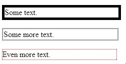
By adding borders to our paragraphs as we did above, we can see the outline of where the paragraph fits into our page. Now, we will see the difference when we apply padding:
|
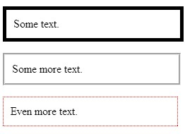 |
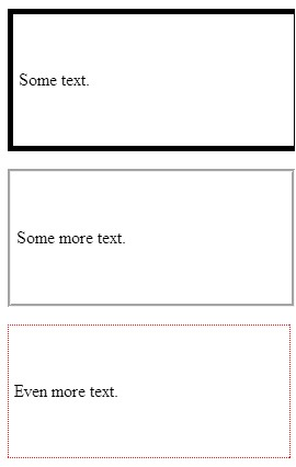
You will notice that the paragraphs still have not moved relative to one another, they each simply take up more space. In order to move them further away from each other, we can add a margin:
|
|
With both examples, we can adjust our values by pixel or percent. We can also control the amount of change by each side of the object, by specifying top, bottom, left or right to our rules. To do this we need to edit our values to only pad the left side of our paragraphs, and only apply a margin to the bottom of each:
|
 |
Instead of writing out multiple rules to adjust sides, we can combine them into one declaration by writing out our values clockwise, starting with top, as padding: top right bottom left or margin: top right bottom left, replacing the words with a fixed or relative value (they can be mixed) and by using zero as a place holder if we do not want the value changed from default:
|
 |
Background
There is a lot we can do with the background of our pages. Colors and images can be applied to all or portions of our content, helping to highlight different elements of our site, and play a large part in the overall look and feel. We can specify colors by their name if they are a basic color like red, white, blue etc. or we can provide its hex value, or the values for its red, green, and blue values.
|
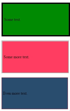 |
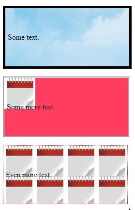
To use images instead of colors, we can specify the image’s location in our files, and can also dictate where we want to place it on our page, whether or not it should repeat, and whether it should move or remain in place when the user scrolls the page. By default, images will repeat to fill the space they are placed in. To prevent this, we can add a no-repeat attribute to our definitions. This time, we will use the background attribute as opposed to the background-color attribute. The benefit of this is that you can include both in a set of rules on the same object (image first, color second), allowing you to have an image on top of a background color. Take note that in these examples, you will need to select your own images in place of those used below.
- <style>
- p.one {
- border-style:solid;
- border-width:5px;
- background:url(clouds.jpg);
- }
- p.two {
- border-style:groove;
- border-width:medium;
- background:url(calendar.jpg) no-repeat;
- background-color:#ff3355;
- }
- p.three {
- border-style:dotted;
- border-width:1px;
- border-color:red;
- background:url(calendar.jpg);
- }
- p {padding:50px 30px 50px 5px;}
- p {margin:50px;}
- </style>
- <p class=”one”>Some text.</p>
- <p class=”two”>Some more text.</p>
- <p class=”three”>Even more text.</p>
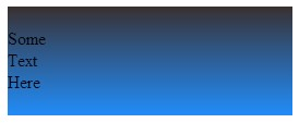
There are two ways of achieving this affect. The first is by using advanced styling through CSS using WebKit features supported by some browsers, and then adding style rules to create the effect as close as possible in other browsers. The second is by creating a repeatable gradient image. The first approach’s reliance on WebKit provides support for Apple and Google products. For browsers that do not use WebKit, we have to add extra rules to achieve the same effect. This is a more advanced example as it requires knowledge of each browser’s needs to create:
- <style>
- #ourBackground {
- background-color: #1a82f7;
- background: url(ourFallBackImage.png);
- background-repeat: repeat-x;
- /* Safari 4-5, Chrome 1-9 */
- background: -webkit-gradient(linear, 0% 0%, 0% 100%, from(#1a82f7), to(#2F2727));
- /* Safari 5.1, Chrome 10+ */
- background: -webkit-linear-gradient(top, #2F2727, #1a82f7);
- /* Firefox 3.6+ */
- background: -moz-linear-gradient(top, #2F2727, #1a82f7);
- /* IE 10 */
- background: -ms-linear-gradient(top, #2F2727, #1a82f7);
- /* Opera 11.10+ */
- background: -o-linear-gradient(top, #2F2727, #1a82f7);
- }
- </style>
- <div id=”ourBackground” width=”300px” height=”300px”>
- <br/>
- Some <br/>
- Text <br/>
- Here <br/>
- <br/>
- </div>
This code should produce an almost identical image in every browser, depending on which rule(s) the browser is able to execute:
 The first three lines of this style script—
- background-color: #1a82f7;
- background: url(ourFallBackImage.png);
- background-repeat: repeat-x;
demonstrate how we create the gradient effect through an image. In this example, ourFallBackImage.png would be a very skinny (1 pixel) wide image as tall as we want our gradient to be. By repeating this image across the X axis (moving horizontally) the image will fill the width of the parent object. By specifying the bottom-most pixel color from our image as the background, the gradient will appear to fill the page. The balance of our rules in this example achieve the same result through CSS, but also provides more control over the gradient without needing to create additional images.
Float
Floating an object with CSS allows us to move it around within its parent object, ignoring (to some extent) the other items near it. Note that float is only for left/right values, not top/bottom, even though their movement may feel that way as windows resize.
When multiple objects in the same container have the same float style, they will line up next to each other for as many as the container can fit. While this may sound confusing, we will look at it without the terminology: If you have a big box, and that box has small boxes in it, those boxes will fit as many of themselves left-to-right in a row as they can. Any boxes that do not fit will start a new “row” underneath.
The use of float is a big help to responsive styling. Boxes of content that normally fit side by side on a larger screen will automatically create more “rows,” with less items in each, to accommodate screens with less width. Create a page with the following code, and then play around with the size of your browser window to see the resizing in action:
- <style>
- .thumbnail {
- float:left;
- width:80px;
- height:80px;
- margin:5px;
- }
- </style>
- <div>
- <img class=”thumbnail” src=”yourPictureHere.jpg” >
- <img class=”thumbnail” src=”yourPictureHere.jpg” >
- <img class=”thumbnail” src=”yourPictureHere.jpg” >
- <img class=”thumbnail” src=”yourPictureHere.jpg” >
- <img class=”thumbnail” src=”yourPictureHere.jpg” >
- <img class=”thumbnail” src=”yourPictureHere.jpg” >
- <img class=”thumbnail” src=”yourPictureHere.jpg” >
- <img class=”thumbnail” src=”yourPictureHere.jpg” >
- <img class=”thumbnail” src=”yourPictureHere.jpg” >
- <img class=”thumbnail” src=”yourPictureHere.jpg” >
- </div>
Content before and after a floated element will attempt to wrap around it. When we do not want this to happen, we can add a rule to that element’s style to clear the floating effect. To do this, we would add clear: left; clear: right; or clear:both depending which sides we are concerned with.
Useful Feature
Since relative refers to moving the position from where it would be based on all of the other elements and rules, we can use negative values to “pull” an element in that particular direction.
Positioning
We can specify, with great control, exactly where our elements are ultimately located in our window. CSS allows us to modify location to such an extent that an items position on the page can have no relation to its location in your code. Just as we have seen in many of our other rules, there are two methods to declaring position, fixed and relative. Here fixed elements specify the offset of pixels from a side or corner of the window, and relative declares that our values are moving the content from where it would have been if we had not changed it.
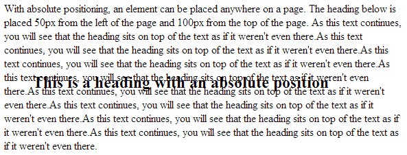
Here is how we might take a heading and force it to an offset from the top left corner as an absolute, meaning it will sit there no matter what else is above, underneath, or around it:
- <style>
- h2 {
- position:absolute;
- left:50px;
- top:100px;
- }
- </style>
- <h2>This is a heading with an absolute position</h2>
- <p>With absolute positioning, an element can be placed anywhere on a page. The heading below is placed 50px from the left of the page and 100px from the top of the page. As this text continues, you will see that the heading sits on top of the text as if it was not even there. As this text continues, you will see that the heading sits on top of the text as if it was not even there. As this text continues, you will see that the heading sits on top of the text as if it was not even there. As this text continues, you will see that the heading sits on top of the text as if it was not even there. As this text continues, you will see that the heading sits on top of the text as if it was not even there. As this text continues, you will see that the heading sits on top of the text as if it was not even there. As this text continues, you will see that the heading sits on top of the text as if it was not even there. As this text continues, you will see that the heading sits on top of the text as if it was not even there.</p>
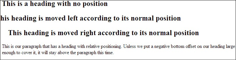
If we wanted to move our heading relative to where it would normally have been positioned (just above our paragraph) we change to relative and provide the offset values that we want. Here, we will move it to the right, move it to the left, and show it as it was:
- <style>
- h2.pos_left {
- position:relative;
- left:-20px;
- }
- h2.pos_right {
- position:relative;
- left:20px;
- }
- </style>
- <h2>This is a heading with no position</h2>
- <h2 class=”pos_left”>This heading is moved left according to its normal position</h2>
- <h2 class=”pos_right”>This heading is moved right according to its normal position</h2>
- <p>This is our paragraph that has a heading with relative positioning. Unless we put a negative bottom offset on our heading large enough to cover it, it will stay above the paragraph this time. </p>
Z-index
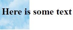
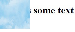
Just when you thought we had escaped the terrors of precedence and inheritance, we have another factor in our layering to consider. The z-index of an object determines its order in the stack of elements on a page. This is how we can control which items are depicted as on “top” of another when they occupy the same portion of a page. While items are automatically layered according to their location on the page and in our code, these can be modified and overridden by a z-index to set the order we want. A larger value of a z-index forces an object “higher” on the page, or, puts it closer to the “top” of all the elements you are looking at. A page background, for example, is usually the lowest level on your page. As such, other content on your page sits on top of your background layer, and becomes the next layer in the stack. A simple way to ensure important messages are never hidden behind something else is to assign them a z-index of an extremely large like 99999. You should only use such a method for one or two critical items in a site. In our first example, we will see an image with a negative index that ensures it is behind our text. Then we will change our index value to make it higher, putting it on top of the text instead:
- <style>
- img {
- position:absolute;
- left:0px;
- top:0px;
- z-index:-1;
- }
- </style>
- <h1>Here is some text</h1>
- <img src=”http://bglabs.evade.netdna-cdn.com/files/clouds-seamless-background-824.jpg” width=”100″ height=”100″ />
- <style>
- img {
- position:absolute;
- left:0px;
- top:0px;
- z-index:-1;
- }
- </style>
- <h1>Here is some text</h1>
- <img src=”http://bglabs.evade.netdna-cdn.com/files/clouds-seamless-background-824.jpg” width=”100″ height=”100″ />
Mouse Cursor
While this is not a regular feature in most sites, it can be an important player if you intend for your website to act as if it were an application.
We can add cursor rules to our selectors in order to change the appearance of the mouse cursor when that rule is active. Much the same as working in your operating system, we can select the regular icon, wait (also called working, busy, thinking, etc.), text insert, a pointer, a question mark, and a crosshair. While most of these have little use in the average web page, they come in handy when your end product is more application focused.
I would strongly recommend judicious use of cursor changes, and be sure that your changes are reverted back as soon as it is appropriate (i.e. change your waiting/busy back as soon as an event is compete) as forgetting to reset can leave your user thinking your site (or their system) is locked up or endlessly cycling. The full list of the available cursors is as follows:
|
Value |
Description |
|
auto |
(default) let the browser choose |
|
crosshair |
Crosshair, or “plus,” symbol |
|
default |
The default cursor |
|
e-resize |
Shows resize to the right (note all resize values are compass combinations) |
|
help |
The help (question mark) icon |
|
move |
Item can be moved |
|
n-resize |
Shows resize up |
|
ne-resize |
Shows resize up and right |
|
nw-resize |
Shows resize up and left |
|
pointer |
A pointer (arrow) |
|
progress |
The busy symbol (be careful with this one!) |
|
s-resize |
Shows resize down |
|
se-resize |
Shows resize down and right |
|
sw-resize |
Shows resize down and left |
|
text |
Text line (flashing or steady “I”) |
|
w-resize |
Shows resize left |
|
wait |
Shows busy, wait (be careful with this one!) |
|
inherit |
Inherits value from parent |
Cursor styles can be applied when the element with a CSS attribute that affects the cursor is triggered. This is usually caused by hovering over the object, or when the user initiates an action, in reaction to which we apply the new style using JavaScript. Note that user triggered actions like busy icons normally need to stay “busy” until the script is done. In this case, the body tag should receive the attribute that affects the cursor so it continues to show as busy even if the user moves the mouse off of the button or other trigger that they used.
Learn more
Keywords, search terms: css layout, page formatting, positioning, css layers
LearnLayout: http://learnlayout.com/toc.html
Full layout example without tables: http://www.w3.org/2002/03/csslayout-howto
A set of basic layouts: http://blog.html.it/layoutgala/

![By Matthias Apsel [CC0], via Wikimedia Common](http://commons.wikimedia.org/wiki/File:Boxmodell-detail.gif)