
Section 2: Document Markup
Chapter 21: Font and Text Decoration
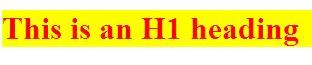
When we began our testing site, we started using HTML tags wherever we could to provide structure to our content with heading tags. We did this with the understanding that later we would redefine those tags so our headings looked how we wanted them to. That time has come. To start with some basics, we can use what we have already learned above by changing the color of the text and background for our heading tags:
|
 |
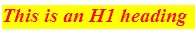
We can also adjust our font family and size. You will notice that none of these changes affect anything outside of our headings. While you may see examples using the key terms for size, ranging from “extra extra small” (xx-small) to “extra extra large” (xx-large), it is a good idea to always be as specific as possible, as key terms can be treated differently between browsers. Instead, our examples will use percentage based and fixed font sizes. To do so, we will make our h1 content italicized and bring the size down to 20px tall:
|
 |
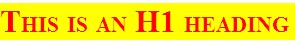
These are just a few examples of the full power of font through CSS. Some “fancier” methods include effects like capitalizing, while simultaneously shrinking, your text (small-caps):
|
 |
Additional notes
Order is Important! Active style rules must come after hover rules, and hover must come after link and visited! Since a link being hovered over can already have been visited, and the active link can be the one with hover on it, this ensures the correct order of application of style.
Text Styles
While our next example seems like it applies more to font than text, a good way to remember what noun you want to use in your rule is whether the affect changes the way the letters appear or not. If they do, you probably want font. If not, then you probably want text as in these next examples.
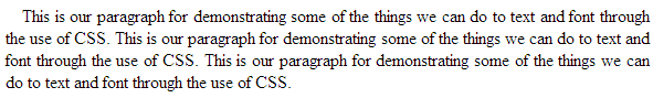
First, we might want to add the lead spaces back into our paragraph’s definition to make them appear more like a written document. We can also move our text around in our containing element by setting it to left (default), right, center, or stretch to fit with justify:
- <style>
- p {
- text-indent:15px;
- text-align:justify;
- }
- </style>
- <p>This is our paragraph for demonstrating some of the things we can do to text and font through the use of CSS. This is our paragraph for demonstrating some of the things we can do to text and font through the use of CSS. This is our paragraph for demonstrating some of the things we can do to text and font through the use of CSS. </p>
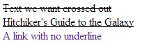
In addition to adjusting the font itself, we can decorate it with more affects like crossing it out, underlining it, or specifying that it should not be decorated, which is especially useful in eliminating the default lines under links:
- <style>
- .strikeOut{text-decoration:line-through;}
- .titles{text-decoration:underline;}
- a {text-decoration:none;}
- </style>
- <span class=”strikeOut”>Text we want crossed out</span><br/>
- <span class=”titles”>Hitchiker’s Guide to the Galaxy</span><br/>
- <span><a href=””>A link with no underline</span>
Anchors
Following up on our ability to remove the underline from a link, there are some other special features we can control for our page anchors using CSS. By specifying link, visited, or hover in our link selector, we can control what happens before, during and after a link has been clicked. We can think of these like applying attributes in our HTML tags, except in CSS the special features are called pseudo-classes. Since we can specify any valid CSS rule, we can have our links change colors, alter the backgrounds, change text and font properties, and everything else we will look at. To see some of the basics in action, we will change our text colors for each action, and also our background color when we are hovering. Since you will need to interact with the links to see these in action, we will forgo an image here and you can test the code yourself:
- <style>
- a:link {color:#FF0000; background-color:yellow;} /* unvisited link */
- a:visited {color:#00FF00; background-color:orange;} /* visited link */
- a:hover {color:#FF00FF; background-color:green;} /* mouse over link */
- a:active {color:#0000FF; background-color:white;} /* selected link */
- </style>
- <a href=”” target=”_blank”>Here is our fake link!</a>
Visually Impaired Considerations
The Internet is obviously a highly visual medium, and it is good practice to keep in mind how your site will be consumed by those with differing visual needs. Here are a few techniques to be better prepared to serve a pleasant user experience.
First is text size. Modern browsers support increasing and decreasing page text on their own (by taking advantage of user style CSS properties). While this reduces the need to provide resizing style sheets for your users to select from, it does mean you should test increasing and decreasing the font size on your site from a browser (usually ctrl and +, ctrl and -). This will allow you to see how far your font size can be pushed before it interferes with your layout. You might need to adjust your style to accommodate these changes. How many levels you wish to account for is up to you, but a general rule of thumb is your page should support +3 with little disruption. You can of course offer special style sheets with links to enable them, giving you better control over the changes while still offering your users an adaptable experience.
Second is the ability to offer your users a text only version of the page. This can be done by applying custom style sheets for actions like printing or different devices that fit under our responsive design, which we will look at in more detail next.
Next is contrast. Color contrast between layered items like a link and a background color can be difficult for many users to distinguish and read. This is not to say that colors should never be layered, but that the contrast between them should be easy to distinguish. A helpful way to test this is to view your site with your brightness and contrast settings turned up and down a bit on your monitor to be sure your site is still legible.
Color combinations can also come into play, for example red and green, and green and blue. When these colors are used together, such as on a submit and cancel button that are next to each other, users with certain forms of color blindness can find them hard to read if not indistinguishable. A better approach is to use a cancel link of regular text next to a large submit button. This makes the options very visually distinct.
For example, the red/green form of colorblindness (Deuterope) makes red and green colors look more alike:
If you are counting on the color of the button to be an important indicator of function, that affect has been lost. Even worse, if you have combined text and background colors that do not lend themselves to readability for the colorblind, they may not be able to interpret the button’s function at all!
These considerations are just some examples of a much larger topic, which is accessibility. The W3C maintains a full list of items to be considered to improve your site for the widest variety of users, and there are a number of sites that can scan your pages to provide notes and tips that follow the W3C guide, including one from the W3C itself at http://validator.w3.org/. Sites that pass the W3C validation can add “stamps” to their pages that identify their efforts and support, and to indicate that those considerations have been made.
